About
A bold, young and new energy drink brand entering the Indian market. Galvanoz is a cheaper alternative to the ever growing caffeinated beverage industry in the Indian context. Promising to be premium in taste and built without the hefty MRP label that usually comes with it. Galvanoz aspires to cater to the hopes, ambitions and will of the common folk.
Client
Heli Beverages India
Timeline
Sept 2022 – Oct 2022
What I did
Branding, packaging, Illustration, Copy writing
Project Type
Freelance
Overview
Brief
Creating branding and packaging for a high quality yet affordable energy drink named ‘Galvanoz’. Having two variants classic and original both exclusively for the Indian market. My goal was to help Heli Beverages in designing brand identity and their product. I designed a logo, created the whole brand identity that has been applied to the packaging, website and designed multiple materials for online and offline use.
Tools used
Adobe Illustrator | Photoshop | Aftereffects
Ideation and Exploration
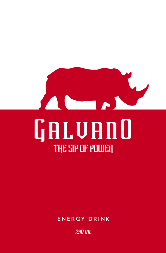
The process began with multiple discussions with the client in order to understand their needs, expectations, the target audience etc. For a span of two weeks I made multiple concepts an iterations and received feedback for the same.
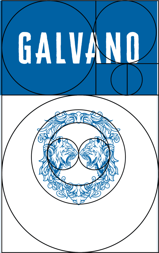
Upon multiple feedbacks, competitive analysis from a third- party sources there was some clarities started to emerge. The theme of a powerful animal became a recuring pattern in the designs that were being appreciated. The use of a single color or shades of the same became important to reduce manufacturing and printing costs. Also the client preferred to use Fibonacci number in design elements as an auspicious astrological intervention.
Design and Iterations
I started this phase with constantly searching for energy cans in my vicinity and buying any I could find to see how well they were designed and to understand the reasoning behind the choices in layouts, color schemes, type, iconography etc
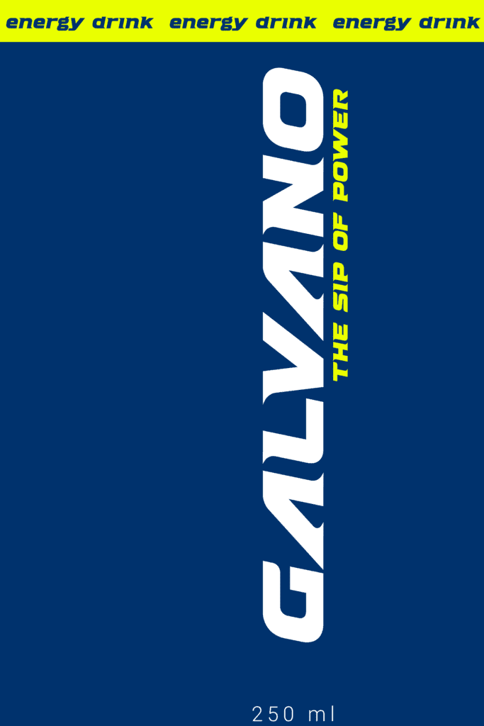
Following which the learnings helped my focus on making the visual identity simple, easy to read, clean and using bold color blocks to make it stand out.
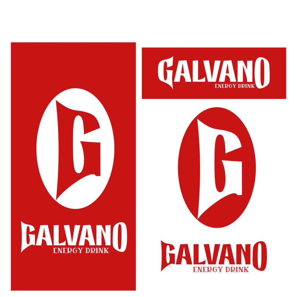
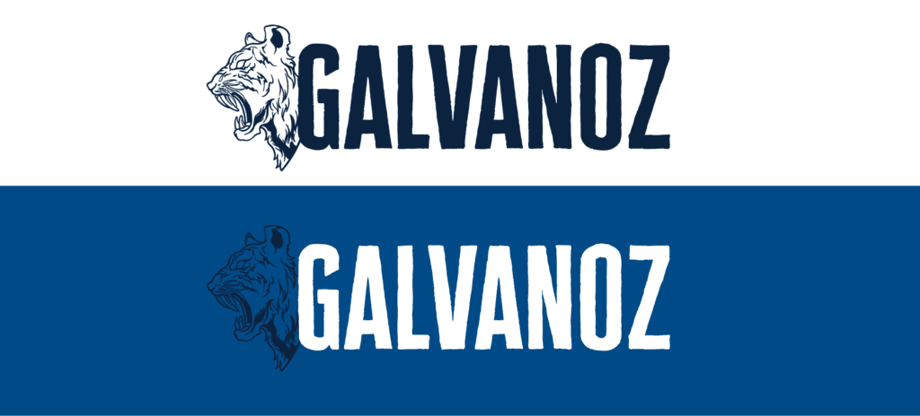
Logo design
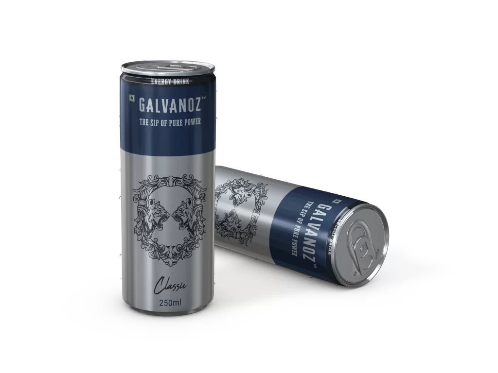
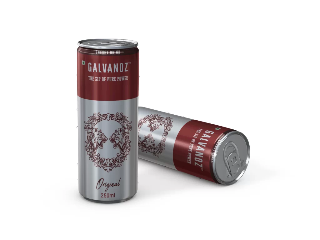
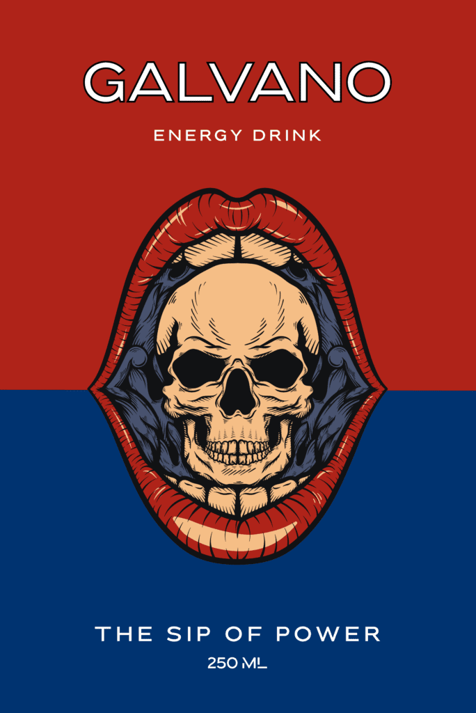
The tiger was chosen as the symbol for many reasons, firstly being the national animal and also the icon for ‘make in India’ campaign, secondly since it’s a powerful predator of the animal kingdom and lastly since it’s closely associated with royalty and by extension makes the brand look more premium.
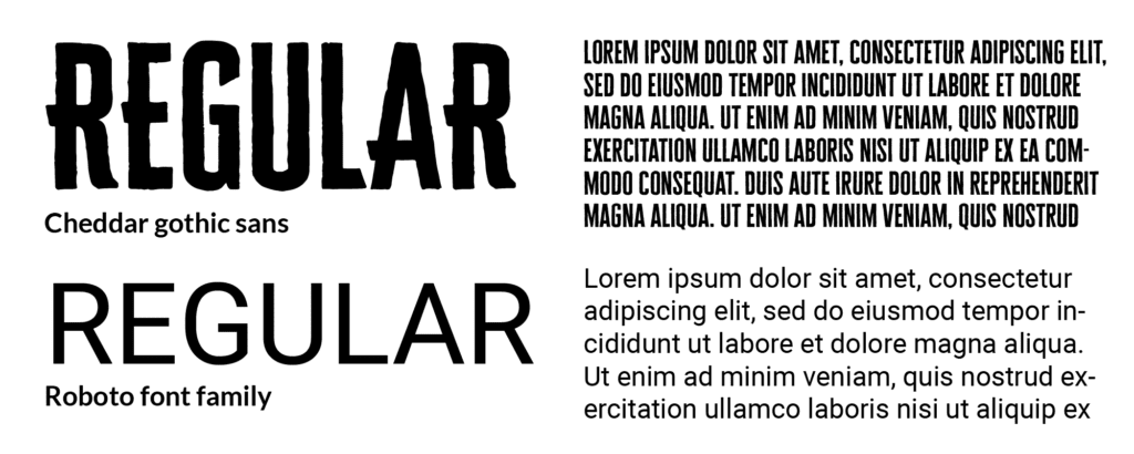
Typography
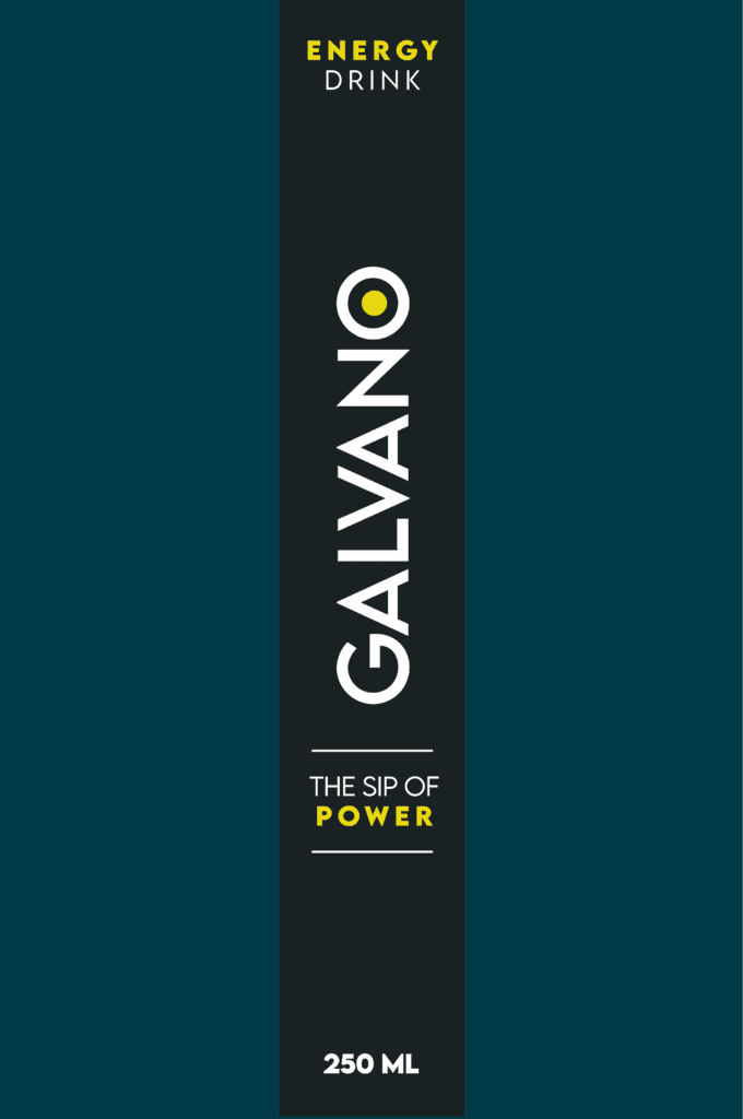
Cheddar gothic is bold, simple yet distinct and goes with tiger as the symbol. Roboto is a clean, established and very well legible font which paired well with the former.
Colors
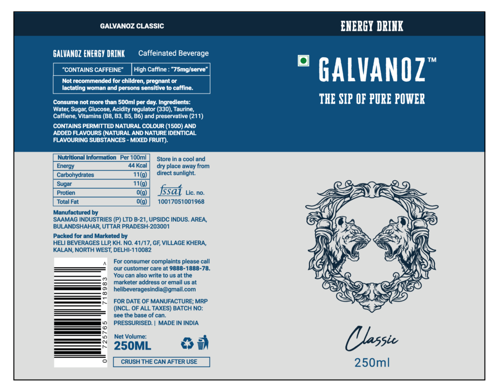
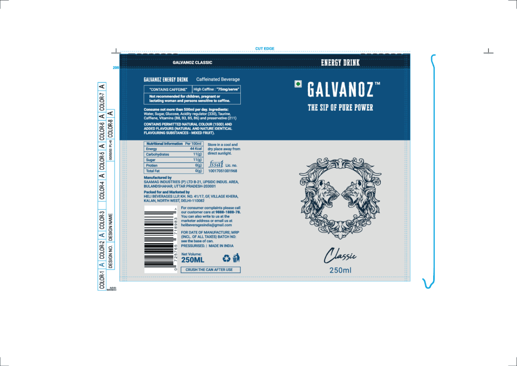
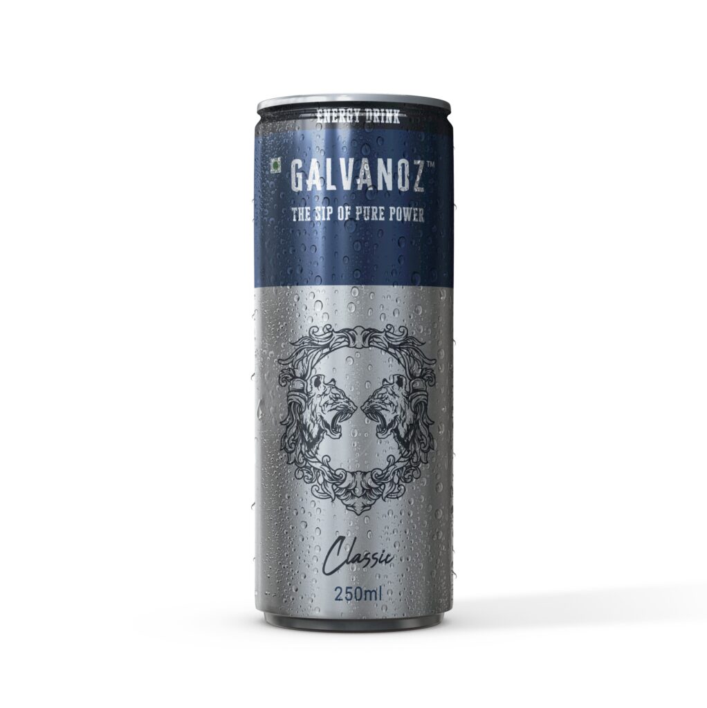
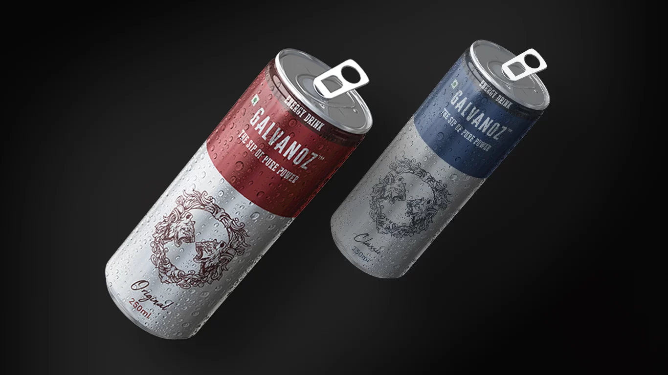
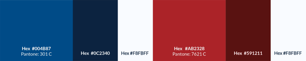
As a color blue has been shown to induce thirst and is universally known for its positive impacts on productivity. The shades of color blue is chosen for ‘Galvanoz classic’ variant because of it’s likability and seen as a sign of reliability.
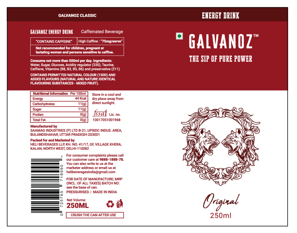
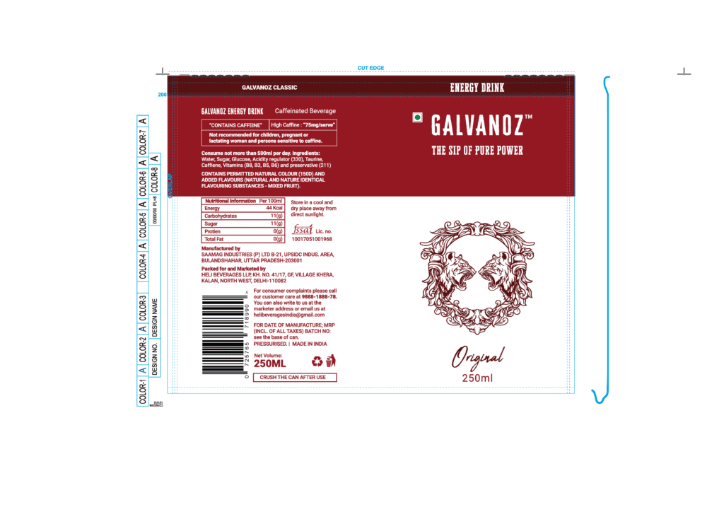
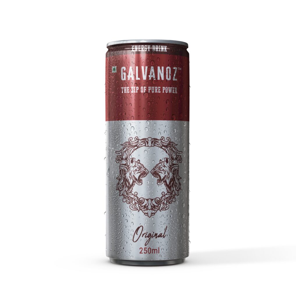
The Color red generally provokes the strongest emotions of any color. The stimulating color is associated with excitement and can naturally spike one’s energy levels. The shades of color red is chosen for ‘Galvanoz original’ variant because of it’s relation to power and passion.
It is also important to note that the colors had to be on the darker side for better visibility on the aluminum can
First Iteration
Since I was on tight schedule, I had to quickly render layout for the can and to help give the client a good visual reference.
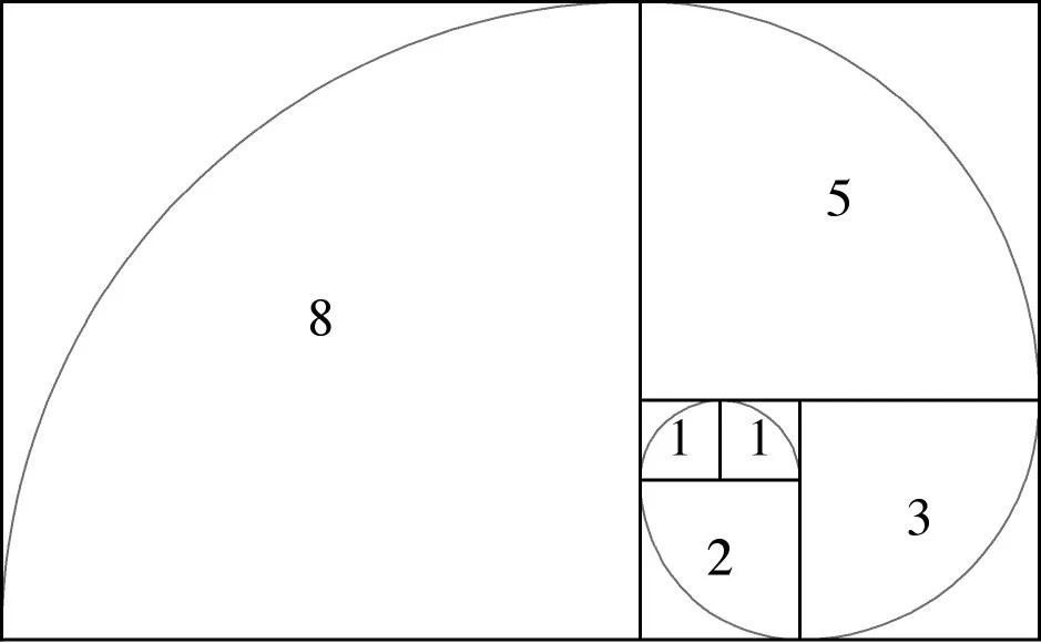
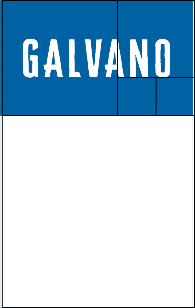
Use of Fibonacci sequence
The Fibonacci sequence appears in Indian mathematics, in connection with Sanskrit prosody. While the client insisted on it’s application for auspicious reasons, Fibonacci number is already a widely used and well established design principle i.e. the golden ration which helped me in creating a beautiful, perfectly balanced design.
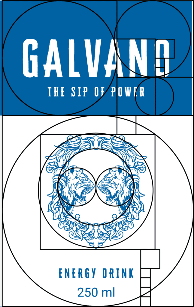
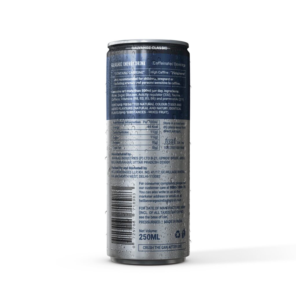
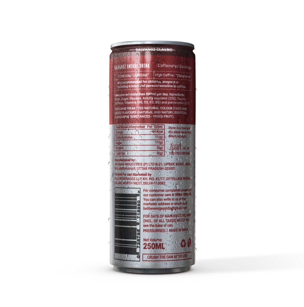
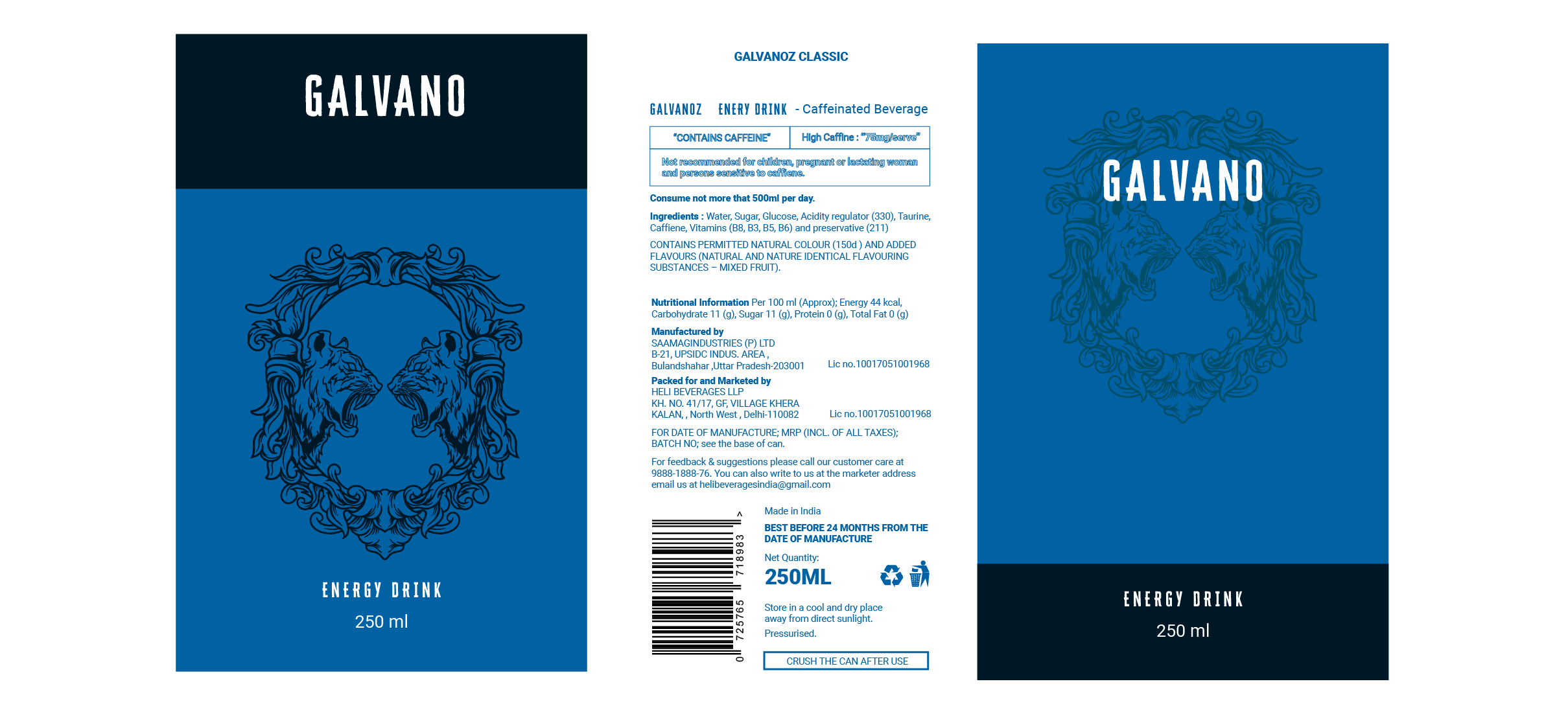
Final Designs
Following are the final labels for the cans that have been sent into production and will be launched in the middle of 2023.